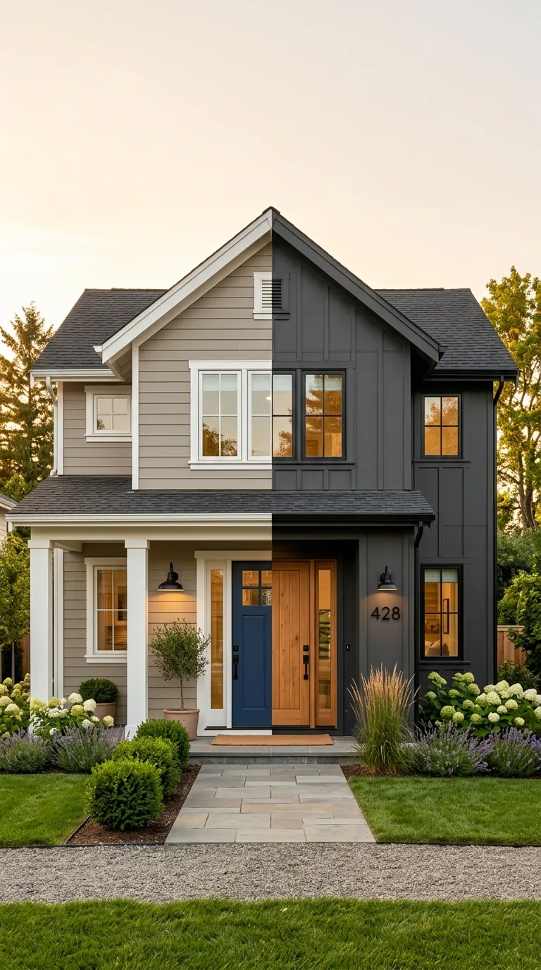
14 Exterior House Paint Colors That Instantly Boost Curb Appeal
A great exterior paint palette is a three-part system: a body color, a trim color, and an accent color that work together instead of fighting for attention. This article walks through 14 exterior house paint colors real, buildable combinations spanning warm neutrals, moody darks, and sun-washed pastels.
Curb appeal isn’t about one hero shade. It’s the way a warm greige body settles into late-afternoon light, the way a black door reads sharper against whitewashed brick, the way a dusty blue-gray facade goes quiet at dusk and glows at noon. Some of these palettes feel grounded and architectural. Others feel breezy, coastal, sun-bleached.
Here are 14 ideas worth saving and stealing.
Why Exterior Color Strategy Works So Well
Exterior color isn’t decoration it’s architecture made visible. Long before “curb appeal” became a real estate buzzword, painters and builders understood that a house’s body, trim, and accent colors either cooperate with its rooflines and window proportions or work against them. This is the same three-part color logic used in classic American foursquares, Craftsman bungalows, and coastal cottages for over a century.
The core materials are what make a palette photograph well: fiber-cement lap siding, board-and-batten panels, whitewashed brick, natural stone veneer, cedar shake, and stucco. Popular current tones include warm greige (Sherwin-Williams Agreeable Gray), soft black (Tricorn Black, Iron Ore), sage and hunter green, and warm white (Alabaster, Swiss Coffee) colors chosen specifically because they hold up against changing daylight, unlike interior paint which lives under constant artificial light.
Exterior repainting is trending now partly because homeowners are staying put longer instead of moving, so they’re investing in the house they have. Real estate data also shows buyers forming an opinion within seconds of seeing a listing photo, which has pushed “instant curb appeal” searches up significantly on Pinterest and Google over the past two years.
Small and modest-footprint homes can absolutely pull off a strong exterior palette in fact, a confident dark body or a crisp monochrome scheme often reads as more intentional on a smaller house than a busy three-color scheme would. The priority for small homes is restraint: one body color, one trim color, and a single accent, applied consistently.
Style at a Glance
| Element | Classic & Neutral | Bold & Moody |
|---|---|---|
| Philosophy | Timeless, resale-friendly, low-risk | Architectural, dramatic, statement-making |
| Materials | Fiber-cement siding, brick, stucco | Board-and-batten, stone veneer, metal roofing |
| Color palette | Greige, warm white, soft taupe | Charcoal, forest green, navy, black |
1. Warm Greige Body With Crisp White Trim
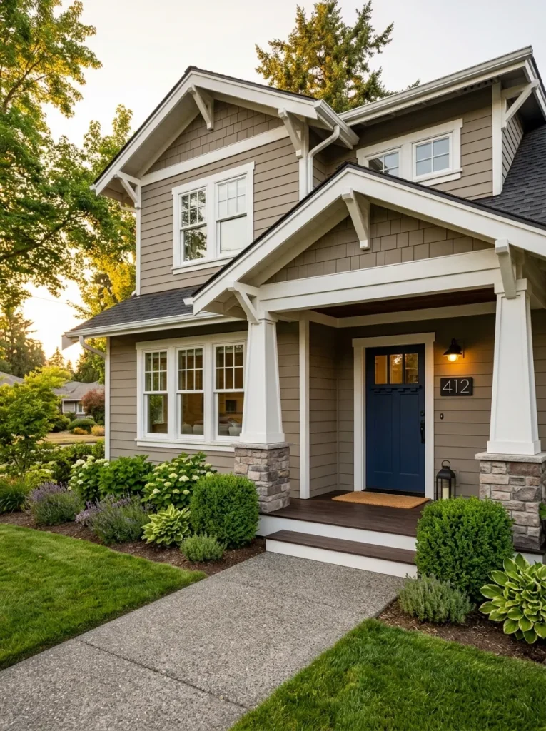
Vibe: Grounded.
Why it works: Greige sits between warm and cool, so it reads differently depending on the light golden and inviting at sunset, quietly sophisticated at midday. Pairing it with a true white trim (not cream) creates the contrast that defines window and roofline shape, a principle called edge definition.
How to get it: Use Sherwin-Williams Agreeable Gray or Behr Perfect Greige for the body, and pure white (Extra White) strictly on trim, fascia, and window casings never blend the two on the same surface.
Quick Win: A single coat of matte black exterior paint on the front door instantly sharpens the whole palette without repainting the house.
Shop The Look
| Product |
|---|
| Matte black exterior door paint quart |
| Black modern house number plaque |
| Boxwood topiary planter set outdoor |
| Jute doormat natural fiber |
| Bronze finish outdoor wall sconce |
2. Board-and-Batten Siding in Deep Charcoal
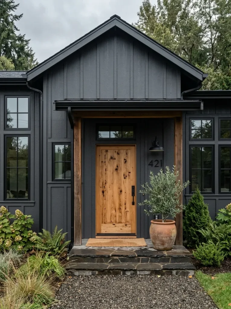
Vibe: Raw.
Why it works: Vertical battens create visual rhythm that draws the eye upward, exaggerating a home’s height a proportion trick borrowed from Scandinavian barn architecture. Charcoal absorbs light rather than reflecting it, so the texture of the battens themselves becomes the visual interest instead of color contrast.
How to get it: Choose Sherwin-Williams Iron Ore or Peppercorn for the batten siding, then leave one architectural element the front door or a porch beam in natural, unstained cedar for warmth.
Shop The Look
| Product |
|---|
| Black metal modern address numbers |
| Matte black exterior gutter guard trim |
| Olive tree artificial outdoor planter |
| Cedar wood entry door unfinished |
| Black outdoor porch light fixture |
3. Warm Brass Sconces Against a Navy Blue Facade
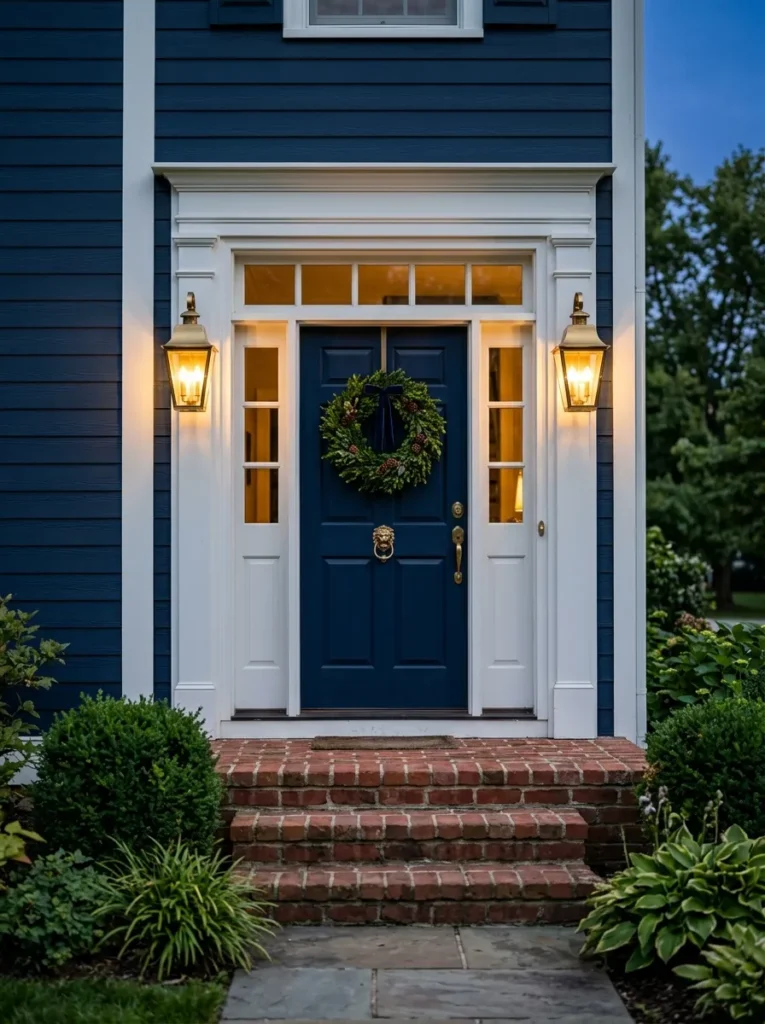
Vibe: Luminous.
Why it works: Warm metal finishes against cool navy create complementary temperature contrast, a principle where opposite color temperatures amplify each other rather than clash. At dusk, brass fixtures cast an amber glow that makes navy siding look almost black, deepening the whole facade.
How to get it: Install brushed or unlacquered brass lantern sconces at entry height (roughly 66 inches from the ground) flanking the door, and let the fixtures oxidize naturally over time rather than sealing them.
Quick Win: Swapping only the porch light fixtures to warm brass is a one-afternoon project that changes the entire evening mood of a navy house.
Shop The Look
| Product |
|---|
| Brushed brass outdoor lantern sconce pair |
| Brass door knocker traditional |
| Boxwood wreath front door |
| Navy blue exterior paint sample |
| Brass house number plaque |
4. Black Wrought-Iron Porch Furniture Paired With Sage Green Siding
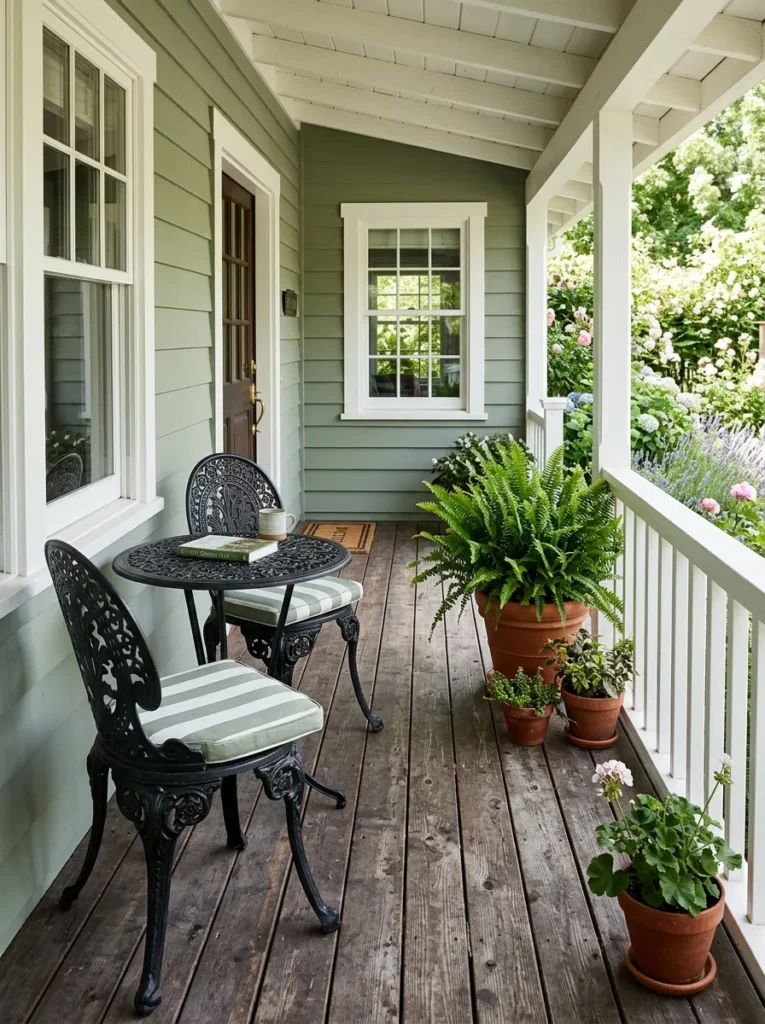
Vibe: Still.
Why it works: Sage green is a low-saturation color, meaning it recedes into landscaping rather than competing with it a technique landscape architects call visual blending. Black furniture against it provides just enough visual weight to anchor the porch without breaking that quiet quality.
How to get it: Choose a muted sage like Sherwin-Williams Evergreen Fog for the body, keep porch railings and trim in warm white, and select slim wrought-iron furniture rather than bulky wicker to preserve negative space on smaller porches.
Shop The Look
| Product |
|---|
| Black wrought iron bistro chair set |
| Terracotta ceramic planter pots |
| Striped outdoor cushion covers |
| Sage green exterior paint sample |
| Weathered wood porch storage bench |
5. Natural Stone Accent Base Under a Soft White Body
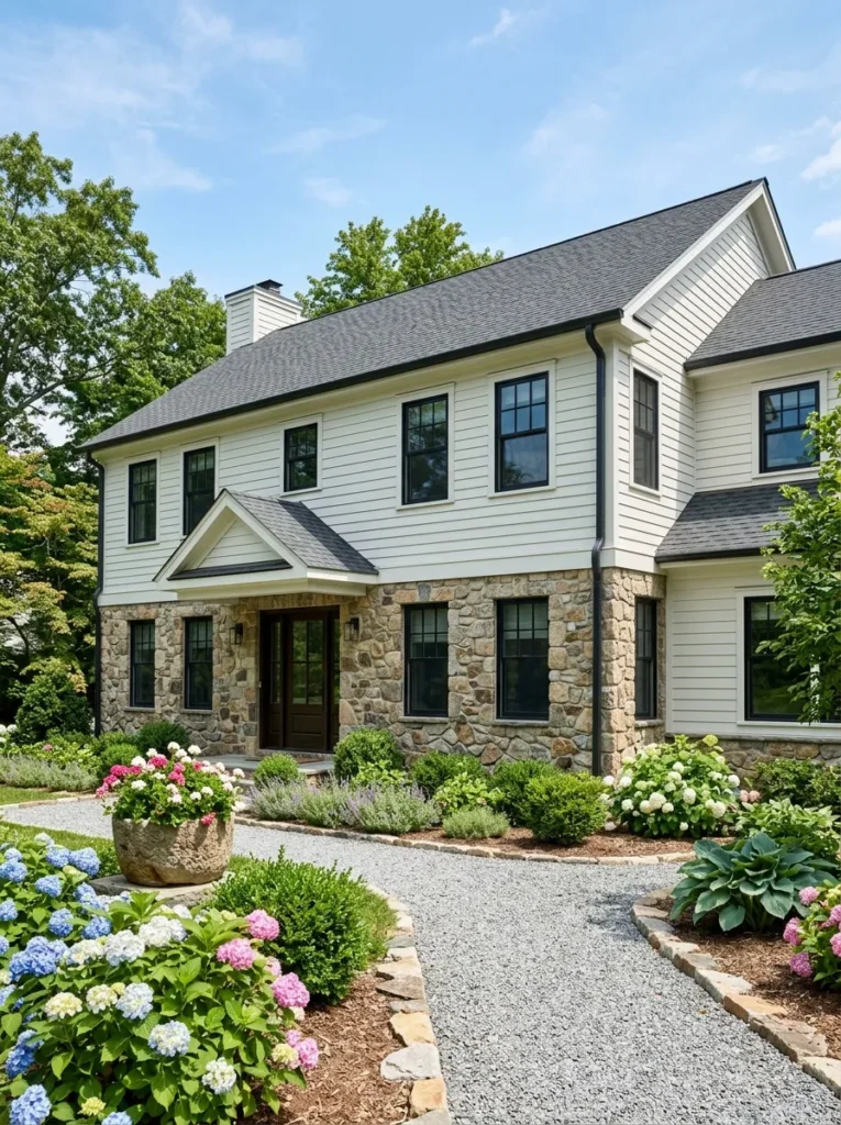
Vibe: Layered.
Why it works: Stacking a heavy, textured material like fieldstone beneath a smooth painted body follows a principle called visual grounding the eye reads the stone as structural weight holding the lighter siding up, even when the stone is only a veneer. This mirrors traditional foundation construction, which is why it feels instinctively “correct.”
How to get it: Use a soft warm white like Benjamin Moore Swiss Coffee for the upper body, and keep the stone veneer in its natural, unpainted state rather than whitewashing it, so the texture contrast stays intact.
Quick Win: Adding a single stone planter box at the base of the entry steps echoes the accent material without a full stone renovation.
Shop The Look
| Product |
|---|
| Natural stone planter box outdoor |
| Hydrangea shrub potted plant |
| Soft white exterior paint sample |
| Black metal window shutters |
| Stone-look outdoor step mat |
6. Black Shutters and a Cedar Front Door on a Cream House
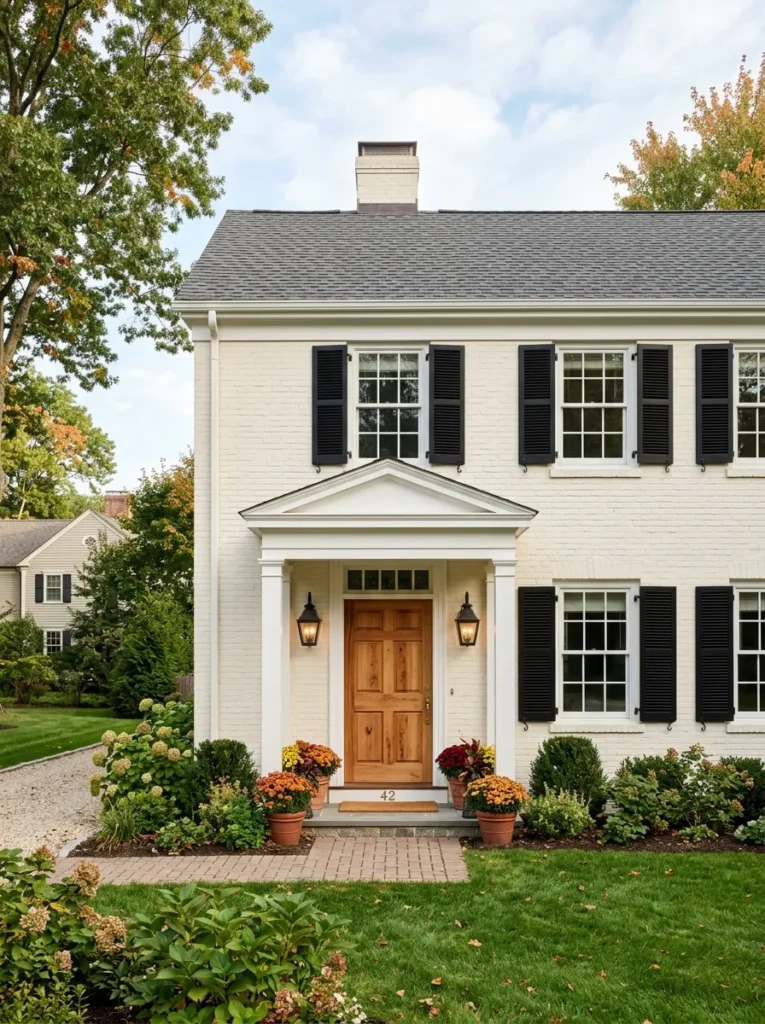
Vibe: Warm.
Why it works: Shutters function as a framing device, drawing a visual box around each window that makes a facade feel more composed. Cream as a body color has enough yellow undertone to stay warm without reading as dated, and it’s forgiving of both morning and evening light.
How to get it: Paint shutters in a true matte black like Benjamin Moore Black Beauty, and leave the front door in raw, oiled cedar rather than staining it a matching brown the grain contrast against cream is the detail that reads as intentional rather than default.
Shop The Look
| Product |
|---|
| Black louvered shutter panels |
| Cedar wood entry door natural |
| Black outdoor lantern sconce |
| Mum plant potted autumn |
| Cream exterior paint sample |
7. Terracotta Blush Stucco for Southwestern Warmth

Vibe: Sun-warmed.
Why it works: Terracotta blush works because it’s essentially a muted version of the surrounding desert palette sand, clay, dried grasses so the house appears to belong to its landscape rather than sit on top of it, a principle landscape designers call contextual color matching.
How to get it: Look for a stucco-specific exterior paint in a dusty clay tone like Behr’s Cavern Clay, and use one saturated accent a turquoise or cobalt door sparingly, since stucco’s texture already reads as visually busy.
Quick Win: Swapping only the front door to turquoise against existing terracotta stucco delivers most of the visual impact for the cost of a single gallon of paint.
Shop The Look
| Product |
|---|
| Turquoise exterior door paint quart |
| Agave plant terra cotta pot |
| Wrought iron outdoor light fixture |
| Woven jute outdoor rug |
| Terracotta stucco paint sample |
8. Two-Tone Vertical Siding to Visually Heighten a Ranch Home
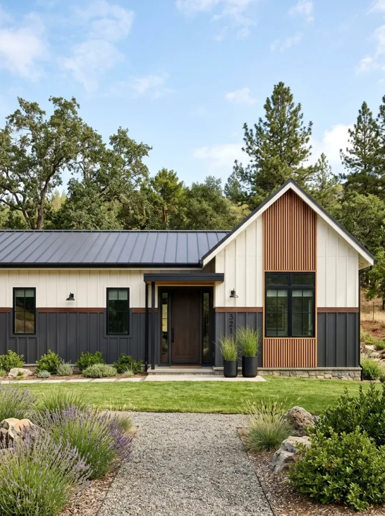
Vibe: Grounded.
Why it works: Single-story ranch homes often read as visually squat because their horizontal lines dominate. Splitting the facade into a darker lower band and a lighter upper band breaks up that horizontal mass and tricks the eye into perceiving added height the same optical principle used in two-tone fashion tailoring.
How to get it: Set the transition line at the top of the window frames rather than the roofline, using a dark charcoal below and a warm white above, with black trim to reinforce the horizontal break.
Shop The Look
| Product |
|---|
| Black modern house number set |
| Ornamental grass potted planter |
| Charcoal exterior paint sample |
| Warm white exterior paint sample |
| Black metal window trim kit |
9. Whitewashed Brick Exterior With Black Window Frames
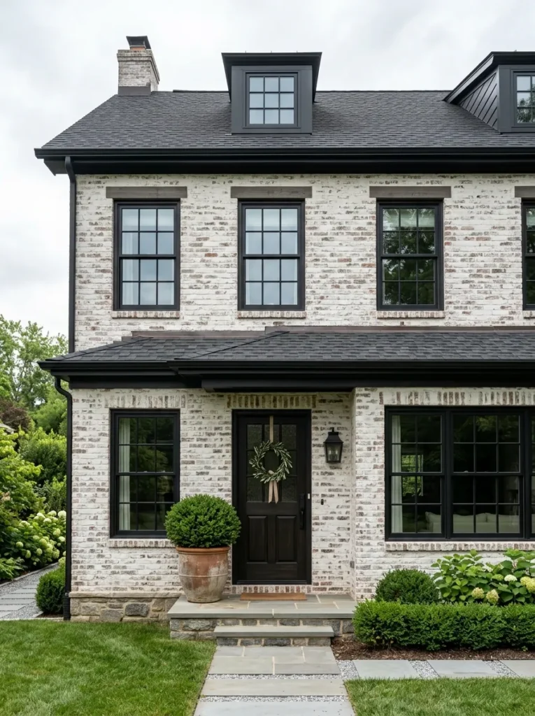
Vibe: Airy.
Why it works: German schmear whitewashing lets the brick’s texture and mortar joints show through instead of covering them completely, preserving material honesty while lightening the overall tone. Black window frames then act as a modern counterweight, keeping the softness from tipping into overly rustic.
How to get it: Apply a mortar-wash mixture (thinned mortar or a whitewash-specific product) with a brush in irregular strokes rather than a roller, deliberately leaving patches of exposed brick for texture variation.
Quick Win: Black window film or paint-grade vinyl inserts can mimic black-framed windows without a full window replacement.
Shop The Look
| Product |
|---|
| Whitewash brick mortar paint kit |
| Black window frame vinyl insert |
| Boxwood topiary potted plant |
| Black outdoor porch sconce |
| Warm gray outdoor doormat |
10. Soft Golden Uplighting on a Dark Forest Green Facade
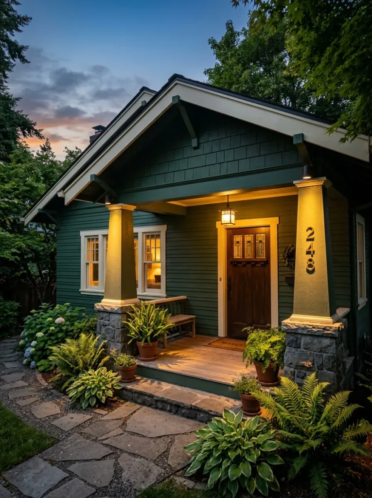
Vibe: Hushed.
Why it works: Dark colors like forest green nearly disappear at night without supplemental lighting, so uplighting placed at the base of porch columns creates dramatic light-and-shadow modeling that reveals architectural texture after sunset a technique borrowed from hospitality and landscape lighting design.
How to get it: Install low-voltage LED well lights at the base of two or three vertical elements (columns or corners) angled upward at roughly 30 degrees, using a warm 2700K bulb temperature to avoid a cold, clinical look.
Shop The Look
| Product |
|---|
| Low voltage LED well light set |
| Forest green exterior paint sample |
| Brass house number plaque |
| Fern potted plant outdoor |
| Warm white LED bulb 2700K |
11. Monochrome Palette to Make a Small Bungalow Feel Larger
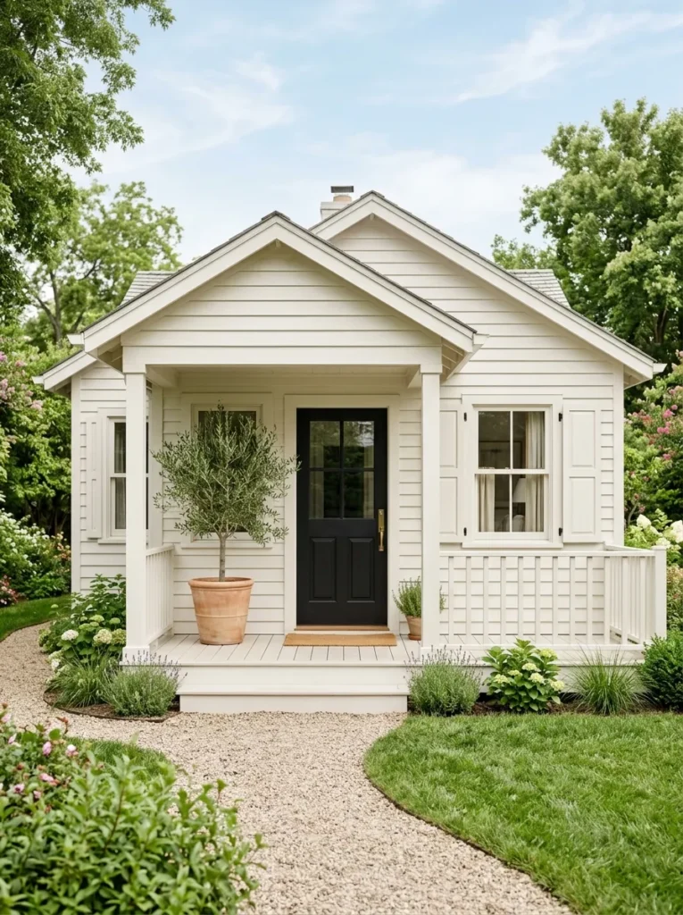
Vibe: Airy.
Why it works: Painting siding, trim, and shutters in the same or nearly the same tone removes the visual “stopping points” that a multi-color scheme creates, so the eye reads the facade as one continuous, larger surface rather than several segmented ones a principle interior designers use with paint-matched trim in small rooms.
How to get it: Choose one warm white or soft greige for body and trim alike, and reserve contrast for a single element typically the front door so the monochrome effect isn’t diluted by multiple accent colors.
Quick Win: Painting the mailbox and house numbers to match the trim color, rather than leaving them black or silver, removes another visual interruption on a small facade.
Shop The Look
| Product |
|---|
| Warm white exterior paint sample |
| Matte black front door paint |
| Olive tree large potted planter |
| Matching-tone mailbox paint kit |
| Simple black porch light fixture |
12. Dusty Blue-Gray Body With Warm White Trim
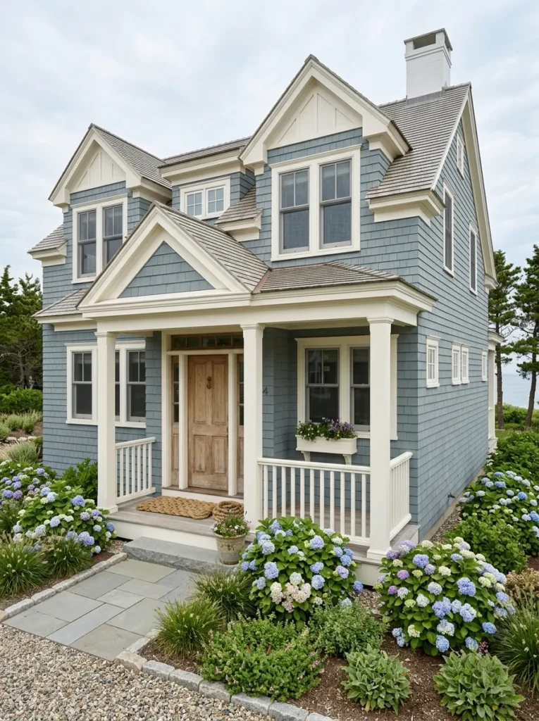
Vibe: Serene.
Why it works: Blue-gray sits at the cool end of the neutral spectrum, which is why it reads as calm and slightly recessive against sky and water the same reason it’s a longstanding choice for coastal architecture. Warm white trim keeps the palette from feeling cold by reintroducing a small amount of warmth at the edges.
How to get it: Choose a low-chroma blue-gray such as Sherwin-Williams Waterloo, paired with a warm (not stark) white trim like Alabaster, and let cedar shingle siding weather naturally rather than resealing it, since a slightly aged gray tone deepens the coastal effect.
Shop The Look
| Product |
|---|
| Dusty blue-gray exterior paint sample |
| Brass door hardware set |
| Coiled rope outdoor doormat |
| Hydrangea shrub potted plant |
| Warm white trim paint sample |
13. Copper House Numbers and Planters Against a Slate Gray Home
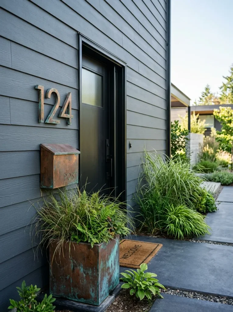
Vibe: Layered.
Why it works: Slate gray is cool and low-saturation, which makes it an ideal backdrop for a warm, high-shine metal like copper the metal becomes the sole point of visual interest rather than competing with a busy palette, a principle called single-accent focus.
How to get it: Choose solid (not lacquered) copper fixtures so the metal oxidizes and deepens over one to two years, and limit copper accents to two or three touchpoints house numbers, a planter, and a mailbox rather than scattering them across the whole facade.
Quick Win: A single copper planter by the front door introduces the accent metal without committing to copper light fixtures or hardware yet.
Shop The Look
| Product |
|---|
| Aged copper house number set |
| Copper finish outdoor planter |
| Ornamental grass potted plant |
| Slate gray exterior paint sample |
| Matte black door hardware set |
14. Weathered Teak Porch Swing on a Coastal White Cottage
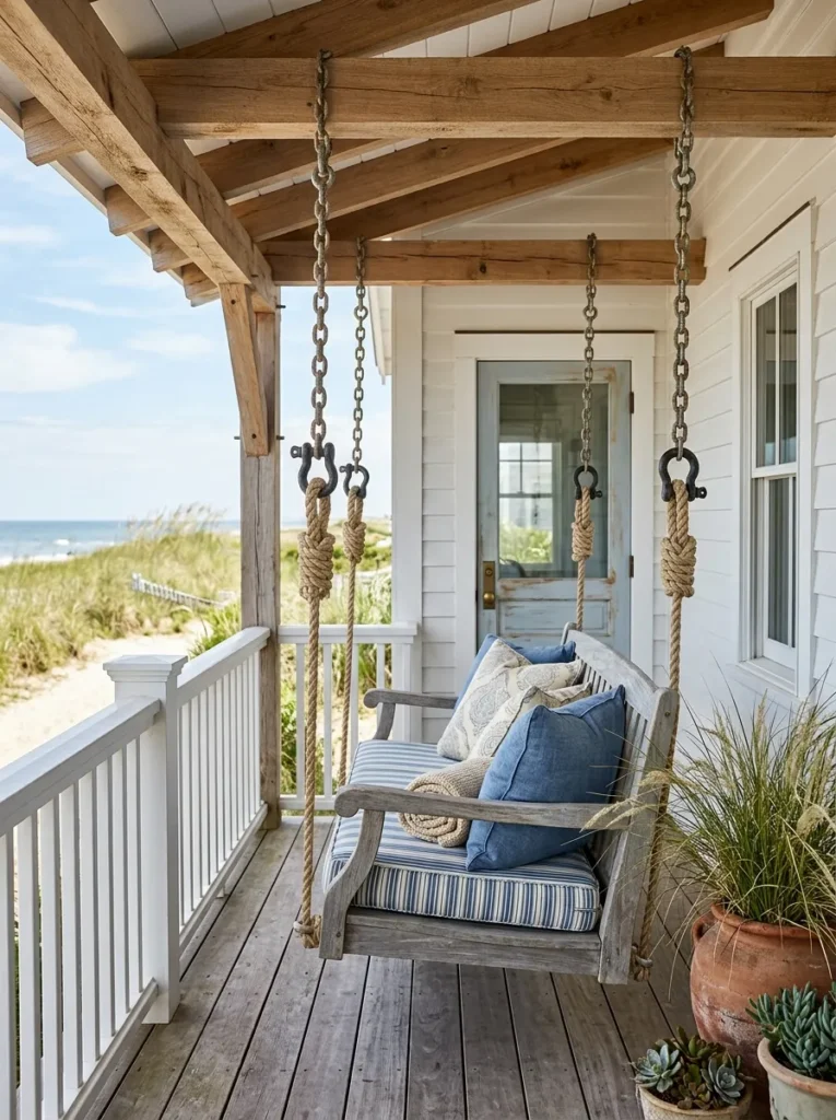
Vibe: Warm.
Why it works: Weathered teak develops a silvery-gray patina over time that echoes driftwood and sea-worn textures, reinforcing a coastal palette through material choice rather than added color. Its horizontal, low profile also keeps a porch feeling open, since a swing takes up less visual and physical footprint than a bulky sofa.
How to get it: Let unsealed teak weather naturally outdoors rather than applying teak oil, which keeps the wood’s original warm tone and slows the silvering process considerably.
Shop The Look
| Product |
|---|
| Weathered teak porch swing with chains |
| Striped outdoor cushion cover set |
| Beach grass potted planter |
| White exterior porch paint sample |
| Natural rope door mat |
How to Start Your Exterior Color Transformation
The single best first move is choosing your body color before anything else not the trim, not the door, not the shutters. Sherwin-Williams Agreeable Gray or a similar warm greige is a safe, resale-friendly anchor because every other decision (door color, hardware finish, planter style) gets chosen to complement it, not the reverse.
The most common mistake is picking a body color and trim color with mismatched undertones a cool gray body next to a warm cream trim, for example. This happens because paint chips look different indoors under artificial light than they do outdoors in full sun. Fix it by testing both colors on a north-facing and a south-facing wall section for at least 48 hours before committing.
For budget entry points under $50 each: a quart of matte black exterior door paint, a single terracotta clay planter for the entry steps, and a set of modern black house numbers.
A full exterior repaint typically takes three to five days for a professional crew and runs $3,000–$9,000 depending on square footage, while a starter version just the front door, shutters, and house numbers can be done in a single weekend for under $200.
Frequently Asked Questions About Exterior House Paint Colors
What’s the difference between a body color and an accent color?
The body color covers the majority of your siding and sets the overall tone, while the accent color is used sparingly — typically just the front door — to create a focal point. A common ratio is roughly 60% body, 30% trim, and 10% accent, which keeps the palette from feeling scattered.
What exterior paint color adds the most resale value?
Warm neutrals like greige and soft white consistently test well with buyers because they read as move-in-ready rather than personalized, according to real estate marketing research. Sherwin-Williams Agreeable Gray and Benjamin Moore Revere Pewter are two of the most frequently recommended resale-safe tones.
How much does it cost to repaint a house exterior?
A professional exterior repaint typically costs between $3,000 and $9,000 for an average single-family home, depending on square footage, siding material, and the number of stories. DIY repaints can run $600–$1,500 in materials alone for the same size home.
Do dark exterior colors work on small or modest homes?
Yes, but with one caveat — a dark body color on a small home should be paired with restraint elsewhere, since too many competing colors on a small facade can make it feel busy rather than intentional. A single dark body with one lighter trim and minimal accents usually reads best.
What’s the most popular exterior trim color right now?
Crisp white and warm off-white (such as Sherwin-Williams Extra White or Benjamin Moore Simply White) remain the most searched trim colors because they provide the strongest contrast against nearly any body color, from navy to sage to charcoal.
Ready to Create Your Dream Exterior Color Palette?
These 14 ideas span moody charcoal siding, sun-warmed terracotta stucco, coastal blue-gray, and quiet monochrome schemes, each built on real material and lighting decisions rather than trend alone. You don’t need to repaint the whole house this weekend starting with just the front door or house numbers is a legitimate first step, not a compromise.
Pick up a quart of matte black or warm brass-toned hardware today and see how it shifts your existing palette. Once it’s done, your home should feel less like a work-in-progress and more like a place that was designed on purpose, down to the last light fixture. Save your favorites now, especially the ones that pair an unexpected metal brass, copper, black with the softest color on this list.