14 Home Color Combinations for Modern Style Homes
Modern style is defined by clean lines, restrained color, and material honesty every surface earns its place. This article gives you 14 modern home color combinations, ranging from bold contrast pairings to whisper-quiet neutrals. Picture a room where light pools across a warm oak floor and settles into a charcoal wall without a single wasted gesture.
There’s a stillness here, the kind that comes from knowing exactly what to leave out. Every pairing feels intentional, grounded, confident never cold, never sterile. Here are 14 ideas worth saving and stealing.
Why Modern Color Palettes Work So Well
Modern interior color theory traces back to the Bauhaus movement and mid-century modernism, where designers stripped rooms down to structure, proportion, and a disciplined palette. Unlike maximalist or traditional styles that layer pattern on pattern, modern design draws its power from restraint color is used as architecture, not decoration.
Core tones include warm charcoal, greige, warm white, and deep navy, paired with grounding accents like terracotta blush, olive, and rust. Materials stay honest: unfinished white oak, honed marble, blackened steel, brushed brass, and boucle upholstery. Nothing is faux-finished or over-embellished the material itself is the detail.
This palette approach is trending now because Pinterest search data shows a sharp rise in “warm modern” and “modern organic” queries, a reaction against the all-gray, all-white interiors of the last decade. People want spaces that feel calm but not clinical, especially as homes double as offices and retreats.
Small spaces can absolutely achieve this look. Prioritize one dominant neutral wall color, then let a single saturated accent like deep navy cabinetry or a terracotta ceramic do the visual work, since too many competing tones will shrink a small room instead of opening it.
Style at a Glance
| Element | Warm Modern | Contrast Modern |
|---|---|---|
| Philosophy | Calm through restraint | Drama through contrast |
| Materials | White oak, boucle, linen | Blackened steel, marble, brass |
| Color palette | Warm white, greige, terracotta | Charcoal, navy, warm white |
The 14 Modern Home Color Combinations
1. Warm Charcoal + Brushed Brass
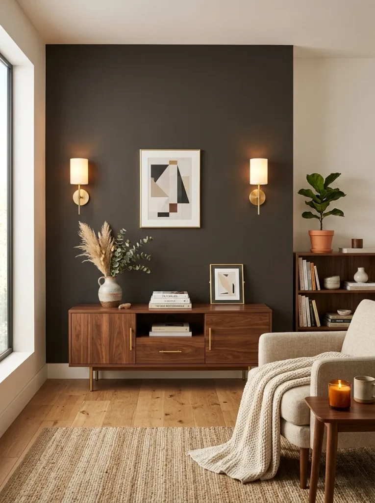
Vibe: This pairing feels grounded, like a room that knows exactly what it wants to be.
Why it works: Charcoal absorbs light and creates visual weight, while brass reflects it the contrast in material behavior (matte versus metallic) keeps the dark tone from feeling heavy. Designers call this “light balancing,” where reflective accents offset an otherwise absorbing color field.
How to get it: Paint one accent wall in a warm charcoal such as Benjamin Moore’s Kendall Charcoal, then introduce brass exclusively through hardware and lighting never furniture to keep the metal feeling architectural rather than decorative.
Quick Win: Swap your existing cabinet pulls for brushed brass knobs; it’s a one-afternoon change that instantly reads as intentional.
Shop The Look
| Product |
|---|
| Warm charcoal matte interior wall paint sample |
| Brushed brass wall sconce pair modern |
| Walnut media console with brass legs |
| Ivory linen throw blanket modern |
| Ceramic vase matte black tall modern |
2. Unfinished White Oak with Matte Black Accents
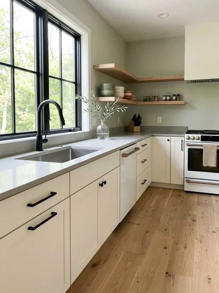
Vibe: This kitchen feels luminous, like sunlight caught in raw wood grain.
Why it works: The visible grain of unfinished white oak introduces texture without color complexity, so the matte black hardware can act as a clean line-drawing against it a classic light-versus-dark contrast principle that keeps a neutral kitchen from reading flat.
How to get it: Choose oak with a low-sheen matte or Rubio Monocoat finish rather than a glossy polyurethane, then pair it with matte black not glossy hardware, since sheen mismatch is what makes this combination look cheap.
Shop The Look
| Product |
|---|
| Matte black cabinet pulls set modern |
| Matte black kitchen faucet single handle |
| Open oak wood floating shelf set |
| Ceramic mixing bowl set neutral |
| Glass bud vase clear modern |
3. Deep Navy + Warm Oak
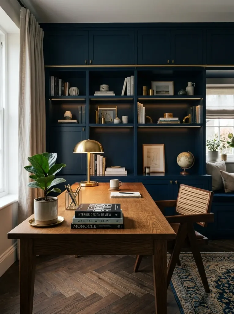
Vibe: This office feels focused, like a study built for long, unhurried afternoons.
Why it works: Navy is a saturated, cool-leaning neutral that reads as sophisticated rather than childish blue, and warm oak’s orange undertone sits directly opposite it on the color wheel, creating quiet complementary contrast without shouting.
How to get it: Use navy on cabinetry or a single wall never the ceiling, which will make the room feel low and let warm oak carry the floor or desk surface so the warmth stays close to eye level.
Quick Win: A navy lacquer picture frame or bookend set introduces the tone without any painting required.
Shop The Look
| Product |
|---|
| Navy blue built-in style bookcase modern |
| Warm oak wood writing desk modern |
| Brushed brass desk lamp adjustable |
| Small potted plant faux modern |
| Linen bound book set decorative neutral |
4. Honed Marble + Walnut
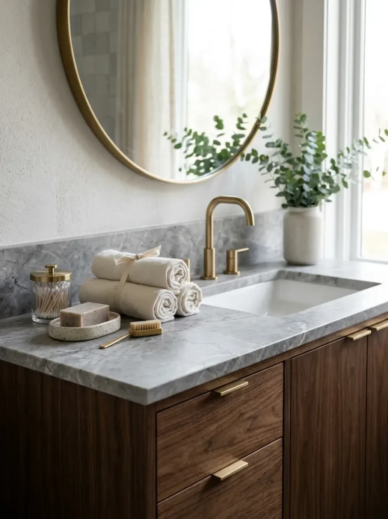
Vibe: This bathroom feels hushed, like a private retreat carved from stone.
Why it works: Honed (matte) marble diffuses light instead of bouncing it, which keeps the room’s coolness in check, while walnut’s deep red-brown undertone warms the palette a material-temperature balancing act between stone and wood.
How to get it: Choose a honed rather than polished marble finish for the countertop, since polished stone will fight visually with walnut’s matte grain, and keep the marble veining subtle so it doesn’t compete with the wood.
Shop The Look
| Product |
|---|
| Walnut wood bathroom vanity cabinet modern |
| Ceramic soap dish matte neutral |
| Ivory cotton hand towel set |
| Glass apothecary jar with lid |
| Brushed brass bathroom faucet single handle |
5. Boucle Textiles in Greige
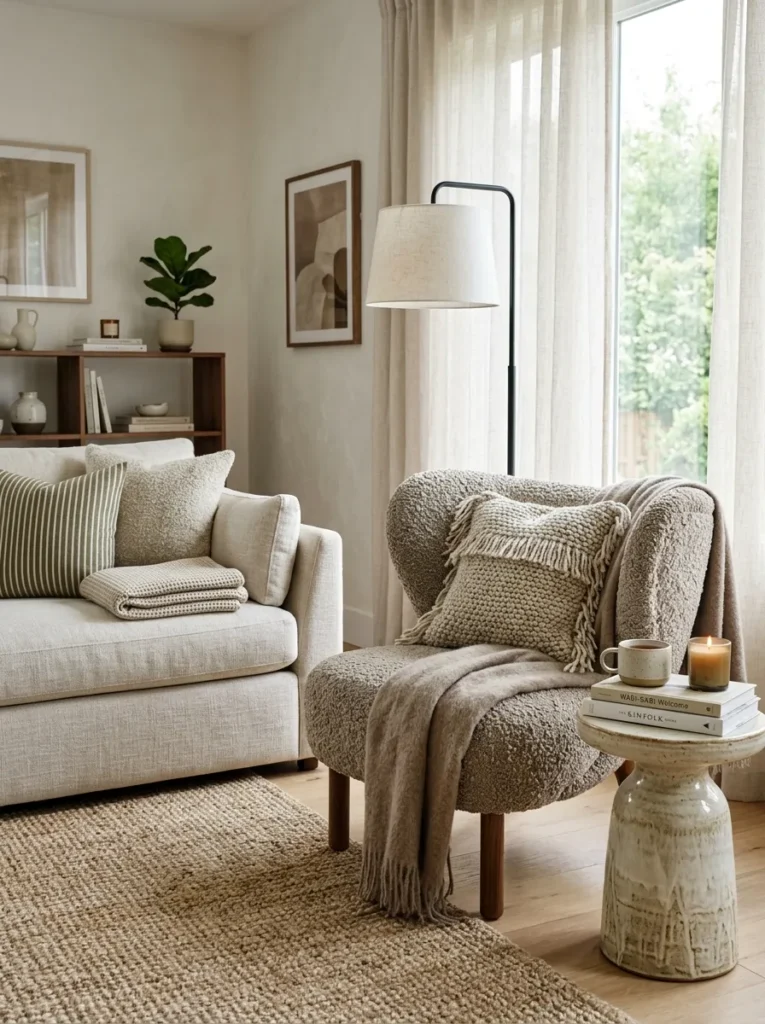
Vibe: This corner feels layered, like texture doing the work color usually does.
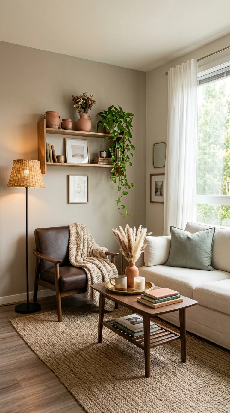
Why it works: Greige a gray-beige hybrid is famously difficult to pair because it can read either warm or cool depending on light, but boucle’s dense woven texture reads as warmth regardless of undertone, solving the greige guesswork through material rather than pigment.
How to get it: Keep every textile in the room within a tight greige-to-taupe range, then let texture do the contrasting: pair smooth linen with nubby boucle and a flat-weave wool rug so the eye reads variety without introducing a second color.
Quick Win: A single boucle throw pillow on an existing sofa tests this palette before committing to reupholstery.
Shop The Look
| Product |
|---|
| Greige boucle accent armchair modern |
| Taupe linen throw pillow cover set |
| Wool flat weave area rug neutral |
| Ceramic side table matte modern |
| Sculptural floor lamp brass modern |
6. Layered Ambient Lighting in Warm Dimmable Tones
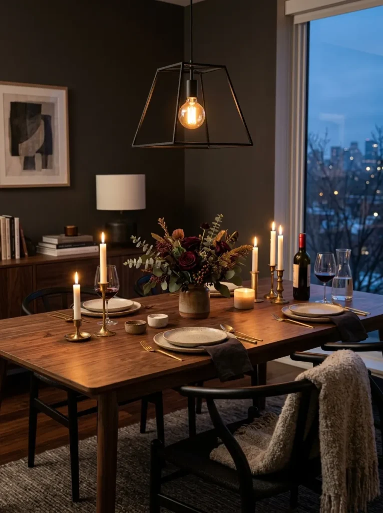
Vibe: This dining room feels warm-lit, like the color palette softens the moment the sun goes down.
Why it works: Modern palettes rely on neutral undertones that shift dramatically under different light temperatures, so layering ambient sources at a consistent 2700K color temperature keeps charcoal, walnut, and greige reading warm instead of flat or gray after dark.
How to get it: Install dimmable warm-white bulbs in every fixture in the room overhead, table lamp, and any wall sconce and set them to the same color temperature so the palette doesn’t shift tone from one corner of the room to another.
Shop The Look
| Product |
|---|
| Matte black pendant light fixture modern |
| Dimmable warm white LED bulb set |
| Ceramic dinnerware set neutral modern |
| Linen dinner napkin set ivory |
| Low profile ceramic centerpiece bowl |
7. Statement Brass Pendant Over a Kitchen Island
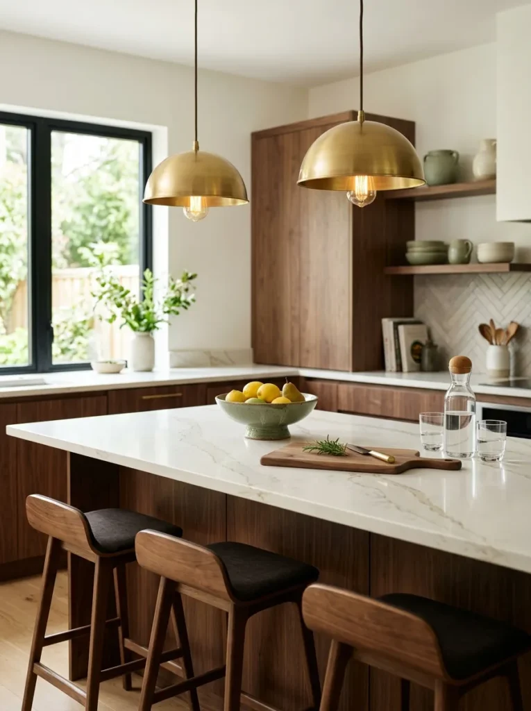
Vibe: This kitchen feels bright, like brass is catching every bit of morning light.
Why it works: A single statement fixture repeated in pairs creates rhythm and visual anchoring above an island, and brass’s warm reflectivity keeps a warm-white countertop from reading sterile a technique designers call “metallic warming.”
How to get it: Hang two matching brass pendants at counter-height plus 30 inches, spaced evenly above the island’s long axis, rather than one oversized fixture, which tends to overwhelm a modern kitchen’s clean lines.
Quick Win: If rewiring isn’t in budget, a plug-in brass pendant kit achieves the same look without an electrician.
Shop The Look
| Product |
|---|
| Brass dome pendant light pair modern |
| Wooden cutting board walnut modern |
| Ceramic fruit bowl neutral matte |
| Glass water carafe with lid |
| Warm white quartz countertop sample |
8. Low-Profile Modular Sofa in Taupe
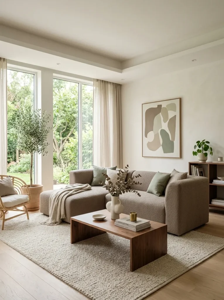
Vibe: This living room feels open, like the furniture is stepping back to let the architecture speak.
Why it works: A low-profile sofa reduces visual mass and lowers the room’s sightline, which makes ceilings feel taller a proportion principle where furniture height directly affects perceived room volume, especially important in a color-restrained modern space with little else to distract the eye.
How to get it: Choose a sectional with an arm height under 26 inches and a taupe tone that sits within two shades of your wall color, so the sofa recedes into the palette rather than becoming its own focal point.
Shop The Look
| Product |
|---|
| Taupe modular sectional sofa low profile |
| Walnut wood coffee table modern |
| Abstract canvas wall art neutral tones |
| Sculptural ceramic vase matte modern |
| Ivory linen throw blanket modern |
9. Sculptural Walnut Coffee Table as Anchor
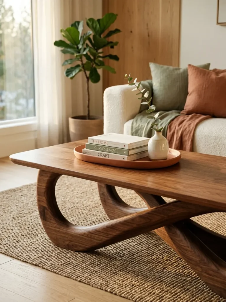
Vibe: This table feels sculptural, like the room’s single confident gesture.
Why it works: In color-restrained modern rooms, a sculptural furniture silhouette carries the visual interest that pattern would provide elsewhere this is the design principle of “form over pattern,” where an organic curved base against straight-edged sofas and shelving creates contrast through shape rather than hue.
How to get it: Choose one furniture piece per room to be sculptural never two and keep every surrounding piece rectilinear, so the curved silhouette reads as a deliberate focal point instead of visual noise.
Quick Win: A ceramic tray with a slightly irregular, hand-thrown edge on an existing straight-edged table borrows this same contrast trick.
Shop The Look
| Product |
|---|
| Sculptural walnut coffee table curved base |
| Ceramic tray hand thrown neutral |
| Linen bound book stack decorative |
| Terracotta bud vase single stem modern |
| Wool throw pillow cover taupe |
10. Abstract Wall Art in Neutral Tones
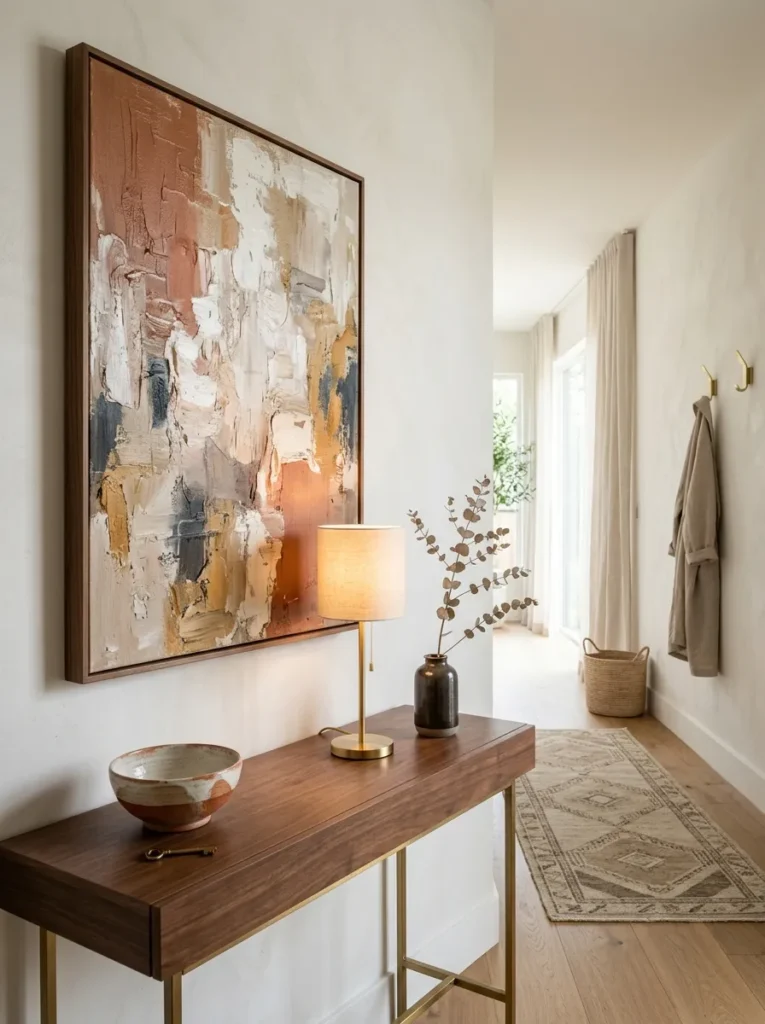
Vibe: This hallway feels luminous, like the art is a window instead of a wall hanging.
Why it works: Abstract art in the room’s exact palette functions as color reinforcement rather than a new addition, deepening the existing scheme instead of introducing competing tones a layering technique that keeps a restrained palette from feeling one-note.
How to get it: Choose an oversized canvas at minimum two-thirds the width of the furniture beneath it with pigments pulled directly from your wall or textile colors, so the piece feels built into the room rather than added on top of it.
Shop The Look
| Product |
|---|
| Abstract canvas wall art set neutral tones |
| Brass table lamp with linen shade |
| Ceramic decorative bowl matte |
| Console table walnut wood modern |
| Dried branch stem decorative faux |
11. Sage and Terracotta Ceramic Vignette
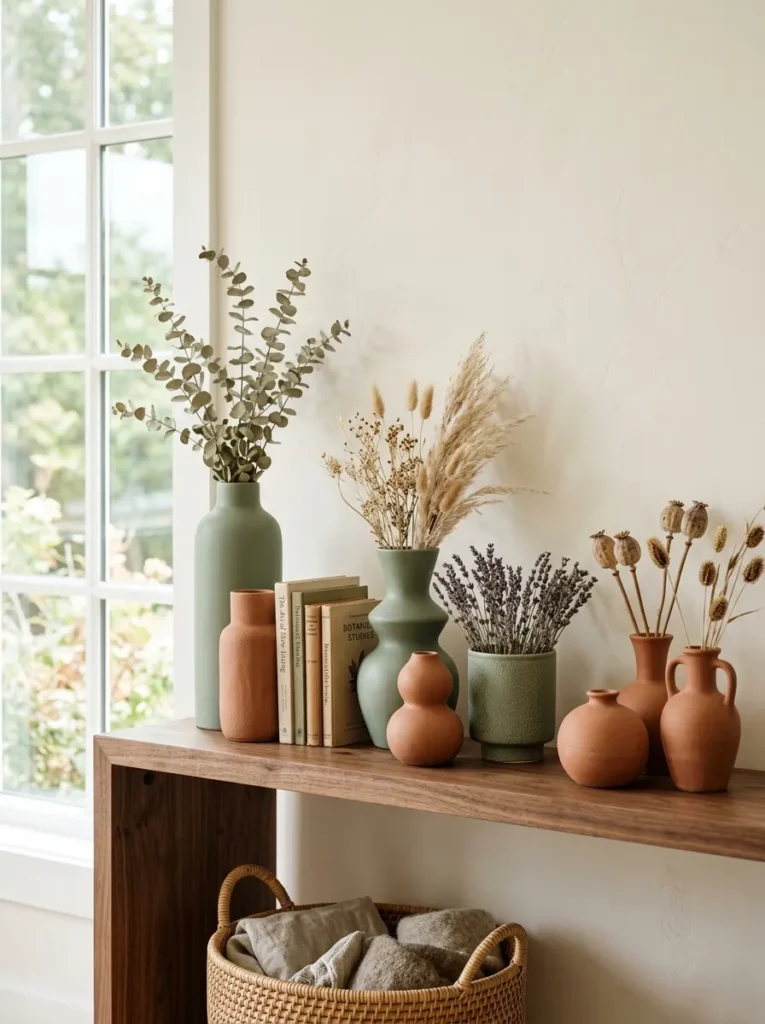
Vibe: This shelf feels earthy, like a small collection built over time.
Why it works: Sage and terracotta sit on opposite temperature ends one cool, one warm but both share a muted, dusty saturation level, which is what keeps them from clashing; matching saturation rather than matching hue is the real rule behind successful color pairing.
How to get it: Group three to five ceramic pieces of varying height and shape but consistent muted saturation, and cluster them in odd numbers so the vignette reads as curated rather than randomly placed.
Quick Win: Start with just two vases one sage, one terracotta before expanding the collection.
Shop The Look
| Product |
|---|
| Sage green ceramic vase matte modern |
| Terracotta ceramic vase matte modern |
| Small woven basket neutral |
| Dried botanical stem bundle faux |
| Linen bound book set decorative neutral |
12. Open-Concept Color Zoning
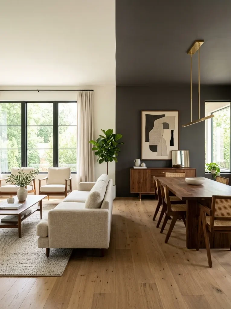
Vibe: This open floor plan feels organized, like each zone knows exactly where it begins.
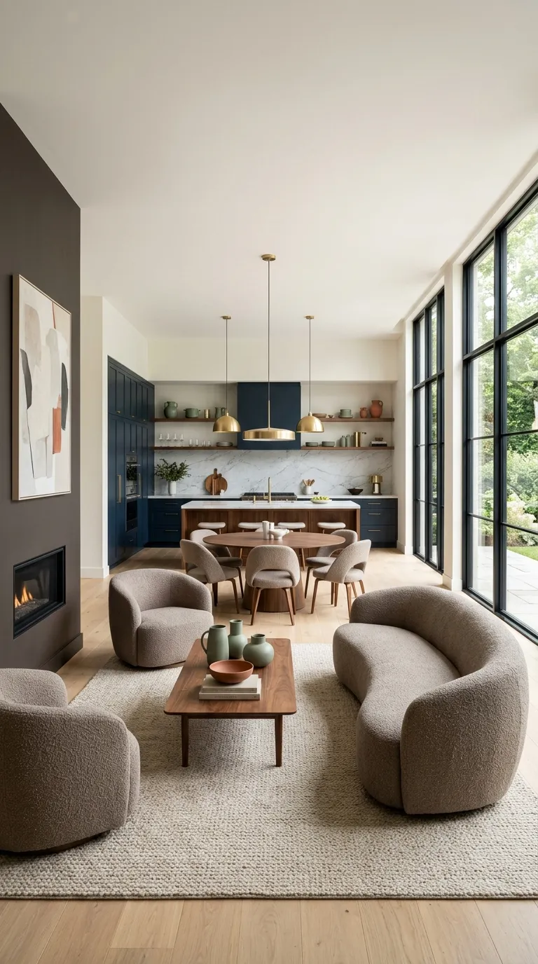
Why it works: In open-concept modern homes, color becomes the wall that isn’t there shifting from warm white to warm charcoal at a defined point signals a change in function without requiring an actual partition, a technique called color zoning that relies on consistent flooring to keep the overall space feeling unified.
How to get it: Choose one paint transition point typically where a ceiling beam, floor material change, or furniture arrangement naturally divides the space and keep flooring, trim, and metal finishes identical across both zones so the color shift feels intentional, not accidental.
Shop The Look
| Product |
|---|
| Warm white interior wall paint sample |
| Warm charcoal interior wall paint sample |
| Walnut console table modern |
| Brushed brass floor lamp modern |
| Ceramic decorative object set neutral |
13. Monochrome Palette for Small Space Expansion
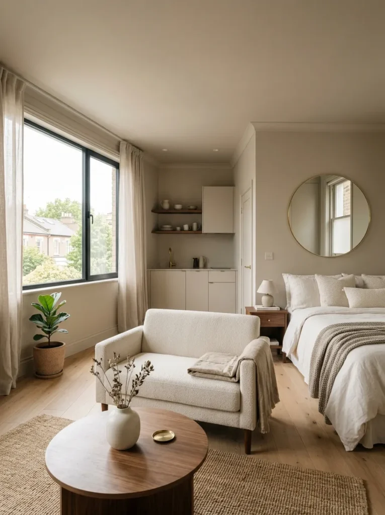
Vibe: This studio feels expansive, like the walls have quietly disappeared.
Why it works: Painting walls, trim, and ceiling in one continuous tone removes the visual stop-points that define a room’s edges, which tricks the eye into reading the space as larger a monochrome technique specifically suited to small modern rooms where furniture footprint is already tight.
How to get it: Choose a single warm greige and apply it in the same sheen across walls, trim, and ceiling, then keep furniture count minimal and leg-heavy so light travels underneath pieces instead of stopping at solid bases.
Quick Win: A large leaning mirror in the same warm greige frame extends this effect without any paint at all.
Shop The Look
| Product |
|---|
| Warm greige interior wall paint sample |
| Leaning floor mirror greige frame modern |
| Walnut leg accent chair small scale |
| Small ceramic vase matte modern |
| Folded linen throw blanket ivory |
14. Compact Furniture in Warm White with Walnut Legs
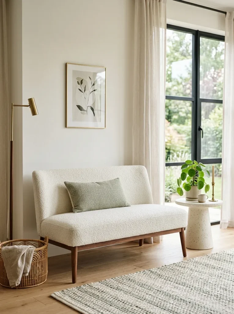
Vibe: This corner feels light, like the furniture is barely touching the floor.
Why it works: Exposed slim furniture legs allow floor color to continue underneath the piece uninterrupted, which is a proportion trick specific to small modern spaces visible floor space reads as available square footage even when the actual footprint hasn’t changed.
How to get it: Choose a loveseat or chair with tapered walnut legs at least four inches tall, upholstered in the same warm white as the surrounding wall, so the piece nearly disappears into the palette and the leg line becomes the only visual break.
Shop The Look
| Product |
|---|
| Warm white loveseat tapered walnut legs |
| Small ceramic side table matte modern |
| Woven throw pillow cover sage |
| Small potted plant faux modern |
| Brushed brass wall sconce modern |
How to Start Your Modern Color Transformation
The single best first move is choosing your dominant wall neutral a warm white, greige, or warm charcoal before buying a single piece of furniture, since every other color decision in a modern home color combinations scheme radiates outward from that base tone.
The most common mistake is mixing wood species with mismatched undertones pairing orange-toned oak with red-toned walnut in the same sightline. This breaks the look because modern palettes rely on material harmony to carry visual interest; the fix is choosing one dominant wood tone per room and using the second only in small, deliberate doses like a picture frame or vase.
Three items under $50 to start: a matte black ceramic bud vase for a shelf, a set of brushed brass cabinet knobs, and a warm-white linen throw pillow cover.
A single accent wall can be painted in a weekend for under $150. A full room transformation walls, lighting, one furniture piece realistically takes four to six weeks and $1,500–$4,000 depending on furniture choices, while a whole-home refresh spans several months.
Frequently Asked Questions About Modern Home Color Schemes
What’s the difference between modern and contemporary color palettes?
Modern color palettes are rooted in a specific mid-century design era and lean on warm neutrals like greige and walnut, while contemporary is an ever-shifting “current” style that borrows freely from whatever is popular now. Modern favors a fixed core palette; contemporary might swap in trending colors like sage or terracotta each season. If you want a scheme that ages well, modern’s restrained approach is the more stable choice.
What colors pair best in a modern home?
Warm charcoal with brushed brass, deep navy with warm oak, and warm white with terracotta blush are three of the most reliable modern home color combinations. Each pairing balances a cool or neutral base with one warm accent, which keeps the palette from feeling flat. Sage green and walnut is another strong option for rooms that want an organic, earthy edge.
How much does it cost to repaint a room in a modern palette?
A single accent wall typically costs $50–$150 in paint and supplies for a DIY job, while a full room averages $300–$600 including trim. Hiring a professional painter adds roughly $2–$6 per square foot depending on your region. Warm charcoal and deep navy often require two to three coats, which can push material costs slightly higher than lighter neutrals like warm white.
Does this color palette work with existing wood floors?
Yes, as long as your existing floor’s undertone is identified first — cool gray-toned floors pair best with charcoal and navy, while warm honey-toned floors pair best with terracotta and sage. Mismatched undertones between floor and wall color are the fastest way to make a modern palette feel unresolved. If your floor already leans warm, lean into it rather than fighting it with a cool gray wall.
What lighting works best with modern color palettes?
Warm dimmable bulbs at a 2700K color temperature are essential, since modern neutrals like greige and charcoal can read cold or muddy under cooler 4000K+ lighting. Brass or matte black fixtures both complement the palette, with brass adding warmth and matte black adding contrast. Layering ambient, task, and accent lighting also helps these deeper tones feel inviting rather than dim.
Ready to Create Your Dream Modern Home?
From bold charcoal-and-brass pairings to whisper-quiet monochrome small-space tricks, these 14 modern home color combinations cover color, material, lighting, and layout in equal measure. You don’t need to tackle all of it at once painting one wall or swapping one set of hardware is a real, complete first step.
Today, pick a single warm neutral for your main living space and pull one sample home before committing to a full gallon. Once the palette settles in, the room will feel steady and unhurried, the kind of space that doesn’t ask anything of you. Save your favorite pairing now, so it’s waiting for you the next time you’re staring at a paint chip aisle.